


In our Shopware CMS-Bundle we created the base of a single FAQ-Element last time. Now we want to add styling to it and do the front end. Maybe you already saw a couple of FAQs and they looked like this:
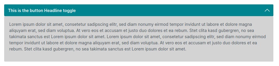
or like this:

Let's extend our element so we can do both with it!
Extending the Configuration
Both of the options should be possible so we need to add a bit of configuration. I will add these fields to our existing element:
Headline color
Headline background color
Text Color
Text background color
Toggle for the border at the bottom
Border color
Icons - chevron or plus?
To add these fields we just adjust our index.js
import './component';
import './config';
import './preview';

Shopware.Service('cmsService').registerCmsElement({
    name: 'single-faq',
    label: 'FAQ',
    component: 'sw-cms-el-cms-single-faq',
    configComponent: 'sw-cms-el-config-single-faq',
    previewComponent: 'sw-cms-el-preview-single-faq',
    defaultConfig: {
        title: {
            source: 'static',
            value: 'Headline'
        },
        content: {
            source: 'static',
            value: `
                <p>Lorem ipsum dolor sit amet, consetetur sadipscing elitr,
                sed diam nonumy eirmod tempor invidunt ut labore et dolore magna aliquyam erat,
                sed diam voluptua. At vero eos et accusam et justo duo dolores et ea rebum.
                Stet clita kasd gubergren, no sea takimata sanctus est Lorem ipsum dolor sit amet.
                Lorem ipsum dolor sit amet, consetetur sadipscing elitr,
                sed diam nonumy eirmod tempor invidunt ut labore et dolore magna aliquyam erat, sed diam voluptua.
                At vero eos et accusam et justo duo dolores et ea rebum.
                Stet clita kasd gubergren, no sea takimata sanctus est Lorem ipsum dolor sit amet.</p>
            `.trim()
        },
        verticalAlign: {
            source: 'static',
            value: null
        },
        icon: {
            source: 'static',
            value: 'solid-chevron-up-s'
        },
        headlineColor: {
            source: 'static',
            value: '#fff'
        },
        headlineBgColor: {
            source: 'static',
            value: '#4492ed'
        },
        collapseColor: {
            source: 'static',
            value: '#333'
        },
        collapseBgColor: {
            source: 'static',
            value: '#d3d3d3'
        },
        border: {
            source: 'static',
            value: null
        },
        borderColor: {
            source: 'static',
            value: '#d3d3d3'
        },
    },

});
Adding fields to the config
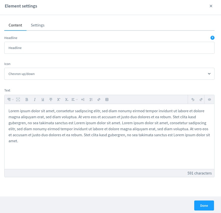
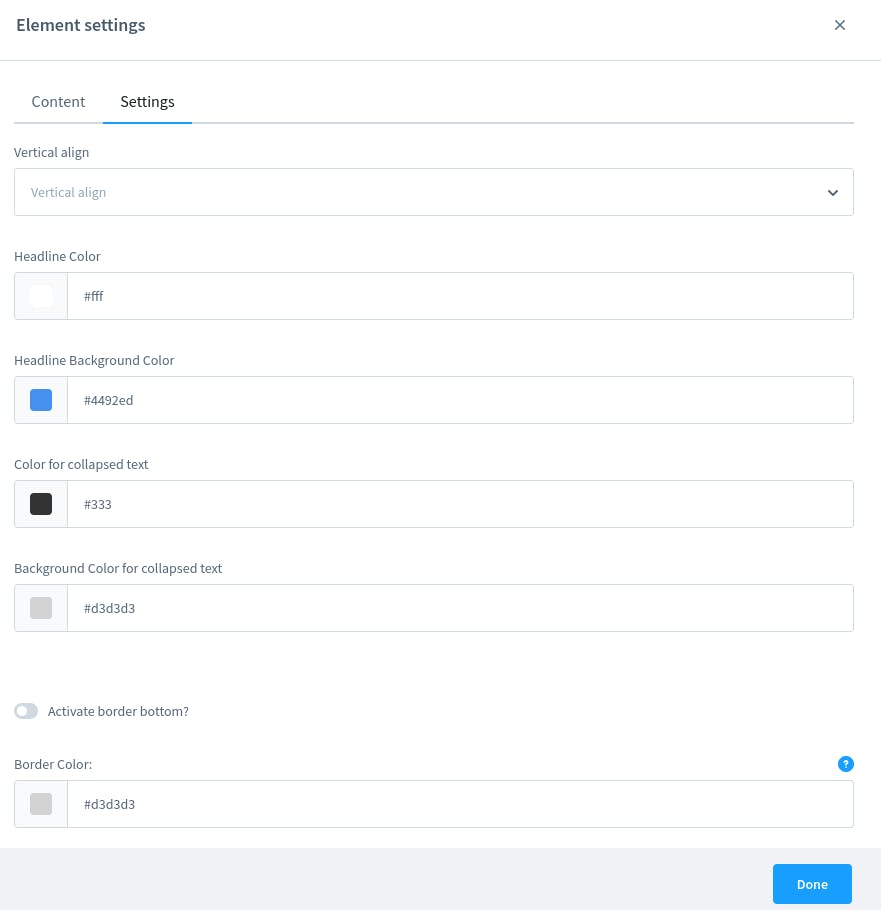
All our fields do exist now. In the next step, we need to add them to the config. So that we can configure everything. We will keep the config in two tabs and I only add the icon field to the content tab. Our final twig file for the config looks like this:
{% block sw_cms_el_config_text %}
    <sw-tabs class="sw-cms-el-config-text__tabs" defaultItem="content">

        <template slot-scope="{ active }">
            {% block sw_cms_el_config_text_tab_content %}
                <sw-tabs-item :title="$tc('sw-cms.elements.general.config.tab.content')" name="content" :active-tab="active">
                    {{ $tc('sw-cms.elements.general.config.tab.content') }}
                </sw-tabs-item>
            {% endblock %}
            {% block sw_cms_el_text_config_tab_options %}
                <sw-tabs-item :title="$tc('sw-cms.elements.general.config.tab.settings')" name="settings" :active-tab="active">
                    {{ $tc('sw-cms.elements.general.config.tab.settings') }}
                </sw-tabs-item>
            {% endblock %}
        </template>

        <template slot="content" slot-scope="{ active }">
            {% block sw_cms_el_text_config_content %}
                <sw-container v-if="active === 'content'" class="sw-cms-el-config-text__tab-content">
                    <sw-text-field :label="$tc('sw-cms.elements.ninja-cms-single-faq.config.label.headline')" v-model="element.config.title.value" @element-update="onElementUpdate" :helpText="$tc('sw-cms.elements.ninja-cms-single-faq.config.helpText.headline')"></sw-text-field>
                    <sw-select-field :label="$tc('sw-cms.elements.ninja-cms-single-faq.config.label.icon')" v-model="element.config.icon.value">
                        <option value="solid-chevron-up-s">{{ $tc('sw-cms.elements.ninja-cms-single-faq.config.label.chevron') }}</option>
                        <option value="solid-minus-s">{{ $tc('sw-cms.elements.ninja-cms-single-faq.config.label.plus') }}</option>
                    </sw-select-field>
                    <sw-cms-mapping-field :label="$tc('sw-cms.elements.text.config.label.content')" valuetypes="string" v-model="element.config.content">
                        <sw-text-editor v-model="element.config.content.value" @input="onInput" @blur="onBlur"></sw-text-editor>

                        <div class="sw-cms-el-config-text__mapping-preview" slot="preview" slot-scope="{ demoValue }">
                            <div v-html="$sanitize(demoValue)"></div>
                        </div>
                    </sw-cms-mapping-field>
                </sw-container>
            {% endblock %}

            {% block sw_cms_el_text_config_settings %}
                <sw-container v-if="active === 'settings'" class="sw-cms-el-config-text__tab-settings">
                    {% block sw_cms_el_text_config_settings_vertical_align %}
                        <sw-select-field :label="$tc('sw-cms.elements.general.config.label.verticalAlign')" v-model="element.config.verticalAlign.value" :placeholder="$tc('sw-cms.elements.general.config.label.verticalAlign')">
                            <option value="flex-start">{{ $tc('sw-cms.elements.general.config.label.verticalAlignTop') }}</option>
                            <option value="center">{{ $tc('sw-cms.elements.general.config.label.verticalAlignCenter') }}</option>
                            <option value="flex-end">{{ $tc('sw-cms.elements.general.config.label.verticalAlignBottom') }}</option>
                        </sw-select-field>
                        <sw-colorpicker v-model="element.config.headlineColor.value" :label="$tc('sw-cms.elements.ninja-cms-single-faq.config.label.headlineColor')" coloroutput="hex" :zIndex="1001" :alpha="true"></sw-colorpicker>
                        <sw-colorpicker v-model="element.config.headlineBgColor.value" :label="$tc('sw-cms.elements.ninja-cms-single-faq.config.label.headlineBgColor')" coloroutput="hex" :zIndex="1001" :alpha="true"></sw-colorpicker>
                        <sw-colorpicker v-model="element.config.collapseColor.value" :label="$tc('sw-cms.elements.ninja-cms-single-faq.config.label.collapseColor')" coloroutput="hex" :zIndex="1001" :alpha="true"></sw-colorpicker>
                        <sw-colorpicker v-model="element.config.collapseBgColor.value" :label="$tc('sw-cms.elements.ninja-cms-single-faq.config.label.collapseBgColor')" coloroutput="hex" :zIndex="1001" :alpha="true"></sw-colorpicker>
                        <sw-switch-field v-model="element.config.border.value" :label="$tc('sw-cms.elements.ninja-cms-single-faq.config.label.activateBorder')"></sw-switch-field >
                        <sw-colorpicker v-model="element.config.borderColor.value" :label="$tc('sw-cms.elements.ninja-cms-single-faq.config.label.borderColor')" :helpText="$tc('sw-cms.elements.ninja-cms-single-faq.config.helpText.borderColor')" coloroutput="hex" :zIndex="1001" :alpha="true"></sw-colorpicker>
                    {% endblock %}
                </sw-container>
            {% endblock %}
        </template>
    </sw-tabs>
{% endblock %}
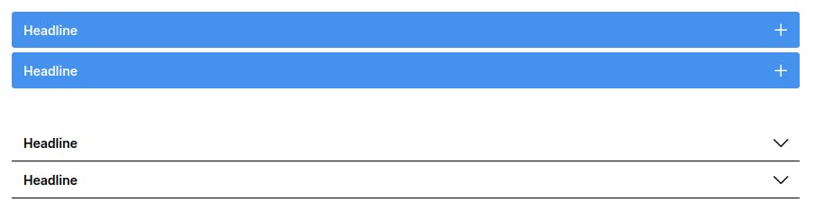
After building the administration the result looks like this:
We can configure everything now but in the administration nothing changes. We need to take care of that as well.
Component Styling in the administration
We have a CMS-Block and a CMS-Element and both come with a preview component. The file we have to adjust is sw-cms-el-single-faq.html.twig, because what we see is not a preview, it's the component!
The JS
To add styling we need to create some computed properties. So we add them to our index.js
import template from './sw-cms-el-single-faq.html.twig';
import './sw-cms-el-single-faq.scss';

const { Component, Mixin } = Shopware;

Component.register('sw-cms-el-cms-single-faq', {
    template,

    inject: ['repositoryFactory'],

    mixins: [
        Mixin.getByName('cms-element')
    ],

    data() {
        return {
            editable: true,
            demoValue: ''
        };
    },

    watch: {
        cmsPageState: {
            deep: true,
            handler() {
                this.updateDemoValue();
            }
        },

        'element.config.content.source': {
            handler() {
                this.updateDemoValue();
            }
        }
    },

    created() {
        this.createdComponent();
    },
    computed: {
        headlineColor() {
            const styles = {};
            if (this.element.config.headlineColor.value) {
                styles.color = `${this.element.config.headlineColor.value}`;
            }
            return styles;
        },
        headlineBgColor() {
            const styles = {};
            if (this.element.config.headlineBgColor.value ) {
                styles.backgroundColor = `${this.element.config.headlineBgColor.value}`;
            }
            return styles;
        },
        collapseStyles() {
            if (this.element.config.collapseColor.value && this.element.config.collapseBgColor.value) {
                return {
                    '--ninja-collapse-clr': this.element.config.collapseColor.value,
                    '--ninja-bg-collapse-clr': this.element.config.collapseBgColor.value
                }
            }
        },
        icon() {
            if(this.element.config.icon.value) {
                return this.element.config.icon.value;
            }
        },
        borderColor() {
            const styles = {}
            if(this.element.config.borderColor.value) {
                styles.borderBottom =  '1px solid ' + `${this.element.config.borderColor.value}`;
            }
            return styles;
        },
    },

    methods: {
        createdComponent() {
            this.initElementConfig('single-faq');
        },

        updateDemoValue() {
            if (this.element.config.content.source === 'mapped') {
                this.demoValue = this.getDemoValue(this.element.config.content.value);
            }
        },

        onBlur(content) {
            this.emitChanges(content);
        },
        onInputText(title) {
            this.emitChanges(title);
        },
        onInput(content) {
            this.emitChanges(content);
        },

        emitChanges(content) {
            if (content !== this.element.config.content.value) {
                this.element.config.content.value = content;
                this.$emit('element-update', this.element);
            }
        }
    }
});
I also added some scss and used CSS variables to change some colors.
The twig
After adjusting the index.js we can add the styling to our component like this:
{% block sw_cms_element_cms_single_faq %}
    <div class="cms-element-admin-single-faq">
        <div :style="[headlineBgColor, borderColor]" class="ninja-single-faq-button">
            <h2 :style="headlineColor" v-model="element.config.title.value" @input="onInputText">{{ element.config.title.value }}</h2>
            <sw-icon :name="icon" :style="headlineColor"></sw-icon>
        </div>
        <div v-if="element.config.content.source === 'mapped'" class="sw-cms-el-text__mapping-preview content-editor" v-html="$sanitize(demoValue)"></div>
        <sw-text-editor :style="collapseStyles" v-else v-model="element.config.content.value" :disabled="disabled" :vertical-align="element.config.verticalAlign.value" :allow-inline-data-mapping="true" :is-inline-edit="true" sanitize-input enable-transparent-background @blur="onBlur" @input="onInput"/>
    </div>
{% endblock %}
We are using the Shopware Component Library to add icons to the component. We also used the Library to add config fields to our configuration. You might want to take a look at it!
The CSS
To make it look a little bit better I also added some CSS. You can see how I use the CSS variables here to change the background and font color of the text editor. We just want to make the look in the administration the same as in the frontend or at least close to it.
.cms-element-admin-single-faq {
    .ninja-single-faq-button {
        width: 100%;
        display: flex;
        justify-content: space-between;
        align-items: center;
        white-space: normal;
        padding: 0 1rem;
        span {
            margin-bottom: 0.75rem;
        }
    }
    .sw-text-editor__box {
        .sw-text-editor__content {
            background: var(--ninja-bg-collapse-clr);
            color: var(--ninja-collapse-clr);
            padding: 0 1rem;
        }

    }
}
There is also some padding so the text is not too close to the edge. That's it for the administration!
The Storefront
Once the administration is done we can take care of our Storefront. Luckily we already created the base in the last post so we just have to add the new config fields to our twig file:
{% block element_single_faq %}
    {%  set config = element.fieldConfig.elements %}
    <div style="{% if config.border.value %} border-bottom: 1px solid {{ config.borderColor.value }} {% endif %}; --ninja-icon-clr: {{ config.headlineColor.value }}" class="cms-element-{{ element.type }}{% if config.verticalAlign.value %} has-vertical-alignment{% endif %}">
        <button style="color: {{ config.headlineColor.value }}; background: {{ config.headlineBgColor.value }}" class="ninja-single-faq-button btn collapsed" type="button" data-toggle="collapse" data-target="#id_{{ element.id }}" aria-expanded="true" aria-controls="collapseExample">
            {{ config.title.value }}
            {% if config.icon.value == 'solid-chevron-up-s' %}
                {% sw_icon 'arrow-head-up' style { 'size': 'xs' } %}
            {% else %}
                {% sw_icon 'plus' style { 'size': 'xs' } %}
            {% endif %}

        </button>

        <div class="collapse" id="id_{{ element.id }}">
            <div style="color: {{ config.collapseColor.value }}; background: {{ config.collapseBgColor.value }}" class="card card-body">
                {% block element_text_alignment %}
                    {% if config.verticalAlign.value %}
                        <div class="cms-element-alignment{% if config.verticalAlign.value == " center" %} align-self-center{% elseif config.verticalAlign.value == " flex-end" %} align-self-end{% else %} align-self-start{% endif %}">
                        {% endif %}
                        {% block element_text_inner %}
                            {{ config.content.value|raw }}
                        {% endblock %}
                        {% if config.verticalAlign.value %}
                        </div>
                    {% endif %}
                {% endblock %}
            </div>
        </div>
    </div>
{% endblock %}
At the moment it just opens and closes, but we also want to see the icons changing. We do that with scss and animate it just a little bit.
  .cms-element-single-faq {
    .ninja-single-faq-button {
        width: 100%;
        display: flex;
        justify-content: space-between;
        align-items: center;
        white-space: normal;
        span {
            margin-bottom: 0.75rem;
        }
        .icon {
            color: var(--ninja-icon-clr);
        }
    }
    .btn:focus, .btn.focus {
        box-shadow: none;
    }
    .card {
        padding: 1rem;
    }
    .icon-arrow-head-up  {
        svg {
            transform: rotate(0deg);
            transition: 0.25s ease-in-out;
        }
    }
    .icon-plus {
        svg {
            transform: rotate(135deg);
            transition: 0.25s ease-in-out;
        }
     }
    .collapsed {
        .icon-arrow-head-up  {
            svg {
                transform: rotate(180deg);
                transition: 0.25s ease-in-out;
            }
        }
        .icon-plus {
            svg {
                transform: rotate(0deg);
                transition: 0.25s ease-in-out;
            }
         }

    }
}
I also disliked the box shadow for buttons in that component so I set it to none. And we can configure the icons but the animations work a little bit differently so we have to keep that in mind.
The Result:
Now we can create both FAQ-Elements. You have to play around a little bit with the margin to get good spacing between the elements.
What else?
Normally it would be nice to have a couple of FAQ Elements underneath each other right? If you take a look at CMS-Layout-Blocks you maybe want to place an image on the left side and 3-4 FAQs on the right side.
That's not possible at the moment. So this is something we could work on next.
CMS-Apps
You might also want to take a look at some of my CMS-Apps I already released in the Shopware Store or simply take a look at my Shopware 6 app overview.
Conclusion
In this blog post, we did some styling for our CMS-Block and our CMS-Element. We extended the configuration and now we can create two different styled FAQ Elements. With that Blog-Post our Single FAQ Element is finally done. Have fun using it! CMS-Elements are still a great way to extend Shopware.
Find the whole code on GitHub.