

Let's create a CMS-Bundle for Shopware 6! We will create more and more basic elements for the bundle. We already started a CMS-Element with basic functionality and we also created our block category. Let's now add those two together and add a bit more functionality!
CMS Base-Bundle - Shopware 6
The whole project can be found on my GitHub. The first CMS-Element we are going to add to this bundle will be a basic button. We will use the CMS-Block that we already created and extend it a little bit. I try to add more and more Elements to the bundle and write about it! Now let's start with the first one!
The CMS-Button
You can do a lot with buttons, right? We will create a very basic button first. Since we already have our base button we will finish fast. This guide is based on these three blog posts:
Adding the block category
To keep everything clean we want our bundle to have its own block categories. So the first thing we are going to do is to add the button to its category. We go to our index.js in src/Resources/app/administration/src/module/sw-cms/blocks/text/cms-button and change the category:
import './component';
import './preview';

Shopware.Service('cmsService').registerCmsBlock({
    name: 'cms-button',
    label: 'sw-cms.blocks.text.ninja-cms-button.label',
    category: 'ninja-text-elements',
    component: 'sw-cms-block-button',
    previewComponent: 'sw-cms-preview-button',
    defaultConfig: {
        marginBottom: '20px',
        marginTop: '20px',
        marginLeft: '20px',
        marginRight: '20px',
        sizingMode: 'boxed'
    },
    slots: {
        button: 'cms-button'
    }
});
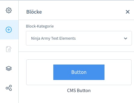
Of course, you would need to create the category first. Let's take a quick look at that as well real quick so that you have everything in one place.
Creating the block category
To create a category we don't need a lot of code. We just need to extend the sw-cms-sidebar.html.twig component:
{% block sw_cms_sidebar_block_overview_category_options %}
    {% parent %}
    <option value="ninja-text-elements">Ninja Army Text Elements</option>
{% endblock %}
Now that's our category. You also need to override the component in the index.js
const { Component } = Shopware;
import template from './sw-cms-sidebar.html.twig';

Component.override('sw-cms-sidebar', {
    template
});
After building the administration we should have a result like this:
Adding more functionality
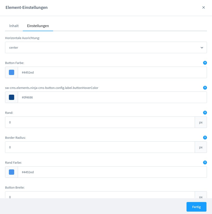
Let's add a bit more functionality. There is a lot you want to configure on a button. Maybe you want a border radius? And what about the alignment? We add the fields in our index.js of the element first:
import './component';
import './config';
import './preview';


Shopware.Service('cmsService').registerCmsElement({
    name: 'cms-button',
    label: 'sw-cms.blocks.text.ninja-cms-button.label',
    component: 'sw-cms-el-cms-button',
    configComponent: 'sw-cms-el-config-cms-button',
    previewComponent: 'sw-cms-el-preview-cms-button',
    defaultConfig: {
        title: {
            source: 'static',
            value: 'ButtonText'
        },
        textColor: {
            source: 'static',
            value: '#fff'
        },
        textHoverColor: {
            source: 'static',
            value: '#fff'
        },
        url: {
            source: 'static',
            value: ''
        },
        newTab: {
            source: 'static',
            value: 'true'
        },
        buttonAlign: {
            source: 'static',
            value: 'center'
        },
        buttonColor: {
            source: 'static',
            value: '#4492ed'
        },
        buttonHoverColor: {
            source: 'static',
            value: '#0f4686'
        },
        borderColor: {
            source: 'static',
            value: '#4492ed'
        },
        borderWidth: {
            source: 'static',
            value: '0'
        },
        buttonWidth: {
            source: 'static',
            value: ''
        },
        buttonHeight: {
            source: 'static',
            value: ''
        },
        borderRadius: {
            source: 'static',
            value: '0'
        }
    },

});
That should be good for now. Maybe we notice that something is missing later. To make it configurable we also need to add those fields in the config twig file:
{% block sw_cms_el_ninja_cms_button %}
    <sw-tabs class="sw-cms-el-config-ninja-cms-button__tabs" defaultItem="content">

        <template slot-scope="{ active }">
            {% block sw_cms_el_config_ninja_button_tab_content %}
                <sw-tabs-item :title="$tc('sw-cms.elements.general.config.tab.content')" name="content" :activetab="active">
                    {{ $tc('sw-cms.elements.general.config.tab.content') }}
                </sw-tabs-item>
            {% endblock %}
            {% block sw_cms_el_ninja_button_config_tab_options %}
                <sw-tabs-item :title="$tc('sw-cms.elements.general.config.tab.settings')" name="settings" :activetab="active">
                    {{ $tc('sw-cms.elements.general.config.tab.settings') }}
                </sw-tabs-item>
            {% endblock %}
        </template>

        <template slot="content" slot-scope="{ active }">
            {% block sw_cms_el_ninja_cms_button_config_content %}
                <sw-container v-if="active === 'content'" class="sw-cms-el-config-ninja-button__tab-content">
                    <sw-text-field :label="$tc('sw-cms.elements.ninja-cms-button.config.label.buttonText')" :placeholder="$tc('sw-cms.elements.ninja-cms-button.config.placeholder.buttonText')" v-model="element.config.title.value" @element-update="onElementUpdate" :helpText="$tc('sw-cms.elements.ninja-cms-button.config.helpText.buttonText')"></sw-text-field>
                    <sw-colorpicker v-model="element.config.textColor.value" :label="$tc('sw-cms.elements.ninja-cms-button.config.label.buttonTextColor')" coloroutput="hex" :zIndex="1001" :alpha="true" :helpText="$tc('sw-cms.elements.ninja-cms-button.config.helpText.buttonTextColor')"></sw-colorpicker>
                    <sw-colorpicker v-model="element.config.textHoverColor.value" :label="$tc('sw-cms.elements.ninja-cms-button.config.label.textHoverColor')" coloroutput="hex" :zIndex="1001" :alpha="true" :helpText="$tc('sw-cms.elements.ninja-cms-button.config.helpText.textHoverColor')"></sw-colorpicker>

                    <sw-field v-model="element.config.url.value" :label="$tc('sw-cms.elements.ninja-cms-button.config.label.buttonUrl')" :placeholder="$tc('sw-cms.elements.ninja-cms-button.config.placeholder.buttonUrl')" :helpText="$tc('sw-cms.elements.ninja-cms-button.config.helpText.buttonUrl')"></sw-field>
                    <sw-field v-model="element.config.newTab.value" type="switch" :label="$tc('sw-cms.elements.ninja-cms-button.config.label.newTab')"></sw-field>
                </sw-container>
            {% endblock %}

            {% block sw_cms_el_ninja_button_config_settings %}
                <sw-container v-if="active === 'settings'" class="sw-cms-el-config-ninja-button__tab-settings">
                    {% block sw_cms_el_cms_ninja_button_config_settings_horizontal_align %}
                        <sw-select-field :label="$tc('sw-cms.elements.ninja-cms-button.config.label.hAlignment')" v-model="element.config.buttonAlign.value" :placeholder="$tc('sw-cms.elements.ninja-cms-button.config.placeholder.hAlignment')">
                            <option value="flex-start">left</option>
                            <option value="center">center</option>
                            <option value="flex-end">right</option>
                        </sw-select-field>
                        <sw-colorpicker v-model="element.config.buttonColor.value" :label="$tc('sw-cms.elements.ninja-cms-button.config.label.buttonColor')" coloroutput="hex" :zIndex="1001" :alpha="true" :helpText="$tc('sw-cms.elements.ninja-cms-button.config.helpText.buttonColor')"></sw-colorpicker>
                        <sw-colorpicker v-model="element.config.buttonHoverColor.value" :label="$tc('sw-cms.elements.ninja-cms-button.config.label.buttonHoverColor')" coloroutput="hex" :zIndex="1001" :alpha="true" :helpText="$tc('sw-cms.elements.ninja-cms-button.config.helpText.buttonHoverColor')"></sw-colorpicker>
                        <sw-field v-model="element.config.borderWidth.value"
                                      type="number"
                                      :label="$tc('sw-cms.elements.ninja-cms-button.config.label.border')"
                                      :placeholder="$tc('sw-cms.elements.ninja-cms-button.config.placeholder.border')"
                                      :helpText="$tc('sw-cms.elements.ninja-cms-button.config.helpText.border')">
                                <template #suffix>px</template>
                        </sw-field>
                        <sw-field v-model="element.config.borderRadius.value"
                                      type="number"
                                      :label="$tc('sw-cms.elements.ninja-cms-button.config.label.borderRadius')"
                                      :placeholder="$tc('sw-cms.elements.ninja-cms-button.config.placeholder.borderRadius')"
                                      :helpText="$tc('sw-cms.elements.ninja-cms-button.config.helpText.borderRadius')">
                                <template #suffix>px</template>
                        </sw-field>
                        <sw-colorpicker v-model="element.config.borderColor.value" :label="$tc('sw-cms.elements.ninja-cms-button.config.label.borderColor')" coloroutput="hex" :zIndex="1001" :alpha="true" :helpText="$tc('sw-cms.elements.ninja-cms-button.config.helpText.borderColor')"></sw-colorpicker>
                        <sw-field v-model="element.config.buttonWidth.value"
                                      type="number"
                                      :label="$tc('sw-cms.elements.ninja-cms-button.config.label.width')"
                                      :placeholder="$tc('sw-cms.elements.ninja-cms-button.config.placeholder.width')">
                                <template #suffix>px</template>
                        </sw-field>
                        <sw-field v-model="element.config.buttonHeight.value"
                                      type="number"
                                      :label="$tc('sw-cms.elements.ninja-cms-button.config.label.height')"
                                      :placeholder="$tc('sw-cms.elements.ninja-cms-button.config.placeholder.height')">
                                <template #suffix>px</template>
                        </sw-field>

                    {% endblock %}
                </sw-container>
            {% endblock %}
        </template>
    </sw-tabs>
{% endblock %}
To see the result you need to build the administration again. If you watch the administration don't forget to build the administration before shipping! The result should look like this:
The frontend
All the new configuration fields need to be displayed on the front end as well. So we need to adjust our twig files once again.
{% block element_text %}
    {%  set config = element.fieldConfig.elements %}
    <div class="cms-element-{{ element.type }} ninja-cms-button-flex ninja-cms-button-flex{% if config.buttonAlign.value == "center" %}-center{% elseif config.buttonAlign.value == "flex-end" %}-end{% else %}-start{% endif %}">
        {% block element_text_button %}
            <a href="{{config.url.value}}" {% if config.newTab.value %} target="_blank" {% endif %}>
                <button class="ninja-cms-btn" style="--ninja-txt-clr: {{ config.textColor.value }}; --ninja-txt-hover-clr: {{ config.textHoverColor.value }}; --ninja-cms-btn-hover-clr: {{ config.buttonHoverColor.value }}; --ninja-cms-btn-bg-clr: {{ config.buttonColor.value }}; border: {{config.borderWidth.value}}px solid {{config.borderColor.value}}; border-radius: {{config.borderRadius.value}}px; {% if config.buttonWidth.value != 0 %}width: {{config.buttonWidth.value}}px;{% else %}width: auto{% endif %}">{{ config.title.value }}</button>
            </a>
        {% endblock %}
    </div>
{% endblock %}
We are using some CSS variables. Let's take a closer look at that in another post.
NOTE: Do yourself a favor if you use VSCode and deactivate Format on Save.
The CSS
Most styles are inline styles but we still need a bit of CSS. I used CSS for the hover colors and the alignment. It looks like this:
.ninja-cms-btn {
    padding: 1rem;
    background-color: var(--ninja-cms-btn-bg-clr);
    color: var(--ninja-txt-clr);

    &:hover {
        background-color: var(--ninja-cms-btn-hover-clr);
        color: var(--ninja-txt-hover-clr);
    }
}

.ninja-cms-button-flex {
    display: flex;

    &-start {
        justify-content: flex-start;
    }

    &-center {
        justify-content: center;
    }

    &-end {
        justify-content: flex-end;
    }
}
And that's our first CMS-Element for the bundle!
Conclusion
The first CMS-Element for our CMS-Bundle is a simple button. We added some functionality to our base and added the button to its own category. Now it's time to add more elements to the bundle. You can find the code on GitHub.
This will be a fun project for me and I try to write about every element here.
Maybe you are missing something on the button or want to give some feedback? I'm happy to hear that!