


We already took a look at how to create a CMS-Block. After that, we also looked into creating a CMS-Element. Then we started our CMS-Base Bundle. It's time to add the second element to it. The first element was a simple button and now we want to stick to the text elements and we are going to add a single FAQ element.
Creating the CMS-Block
The base structure is already existing from the first CMS-Element we build. Let's create a new directory in the text directory since it will be a text block again. We call the folder single-faq. In there we place our index.js file, a component and a preview directory. Now we have our base structure for the block. Let's build the component!
Building the block component
In the component directory we need two files. A index.js and our twig file. Let's take a look at sw-cms-block-single-faq.html.twig
{% block sw_cms_block_single_faq %}
    <div class="sw-cms-block-single-faq">
        <slot name="singleFaq"></slot>
    </div>
{% endblock %}
The block will be the outer wrapper and we place the element in the slot. So that's all the code we need here.
In our index.js we need to register the block now:
import template from './sw-cms-block-single-faq.html.twig';

const { Component } = Shopware;

Component.register('sw-cms-single-faq', {
    template
});
That's it for the block component. Creating CMS-Blocks in the Shopware App-System is also possible but works a bit differently. Let's create the preview block now.
Building the block preview
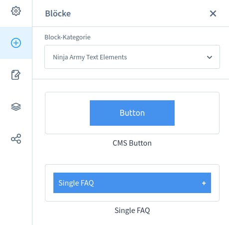
In our preview directory, we will place 3 files. Our index.js, a twig file and a scss file. Since we are creating a FAQ that should open on a click and show content we will add a little '+' to the right side in the preview already. Our preview could look like this:
{% block sw_cms_block_ninja_button_preview %}
    <div class="ninja-flex-center">
        <div class="sw-cms-preview-faq-question">
            Single FAQ
            <span class="faq-icon">+</span>
        </div>
    </div>
{% endblock %}
To make it look like a FAQ-Block we need to add some scss to our sw-cms-preview-single-faq.scss :
.ninja-flex-center {
    display: flex;
    align-items: center;
    justify-content: center;
    padding: 1rem;
    height: 100%;
    .sw-cms-preview-faq-question {
        background-color: #4492ed;
        color: #fff;
        padding: 10px;
        cursor: pointer;
        display: flex;
        justify-content: space-between;
        width: 100%;
    }
    .faq-icon {
        font-weight: bold;
        margin-left: 10px;
    }
}
The last thing we need to do for the preview is to register it in our index.js
import template from './sw-cms-preview-single-faq.html.twig';
import './sw-cms-preview-single-faq.scss';

const { Component } = Shopware;

Component.register('sw-cms-preview-single-faq', {
    template
});
Registering the CMS-Block
At the moment we don't see anything. Let's register the block! In our single-faq directory, we placed an index.js file. Here we can register our block like this:
import './component';
import './preview';

Shopware.Service('cmsService').registerCmsBlock({
    name: 'cms-single-faq',
    label: 'Single FAQ',
    category: 'ninja-text-elements',
    component: 'sw-cms-block-cms-single-faq',
    previewComponent: 'sw-cms-preview-single-faq',
    defaultConfig: {
        marginBottom: '20px',
        marginTop: '20px',
        marginLeft: '20px',
        marginRight: '20px',
        sizingMode: 'boxed''
    },
    slots: {
        singleFaq: 'single-faq'
    }
});
The main entrypoint is the main.js we need to add an import here:
/* Ninja Army Text Elements */
import './module/sw-cms/blocks/text/cms-button';
import './module/sw-cms/elements/cms-button';

import './module/sw-cms/blocks/text/single-faq';

/* Import the sidebar directory */
import './module/sw-cms/component/sw-cms-sidebar';
After building the administration, we get this result:
Creating the CMS-Element
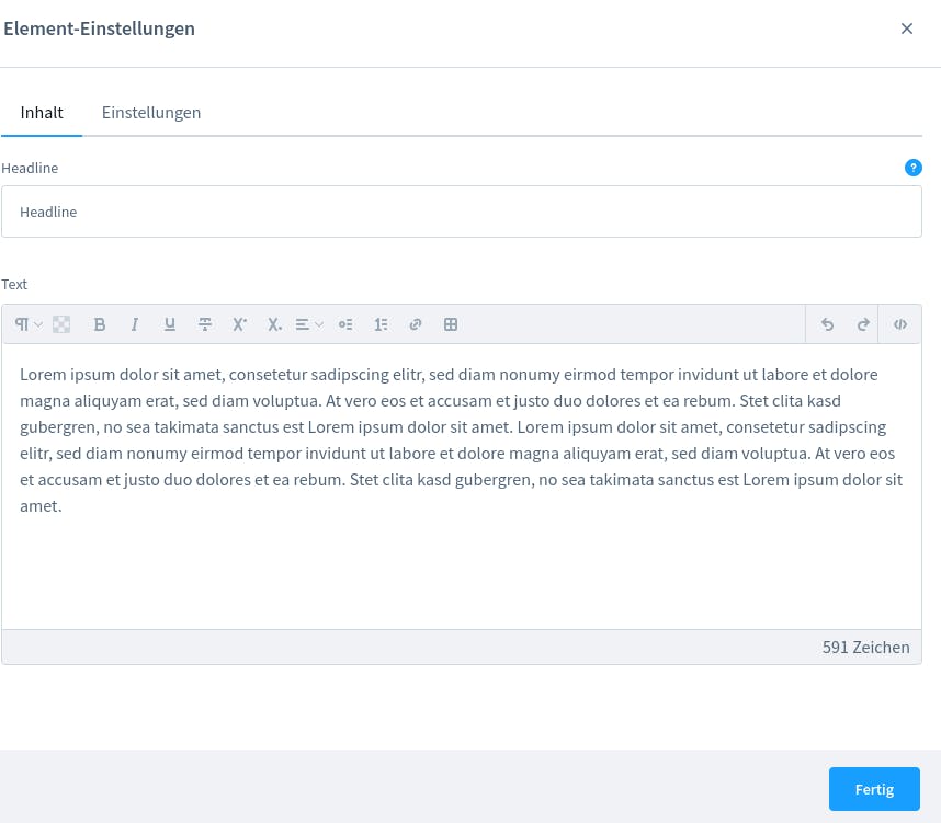
It's time to create the CMS-Element. Luckily we already have everything that we need. The normal text element is almost enough to create a FAQ element. The only thing we need to do is to add a text field for the headline. Take a look at the text element from Shopware. That's what we will create as well!
Let's add a single-faq directory in our elements directory and place an index.js there. Now we need to create the three directories component, config and preview and we can start!
Creating the CMS-Element component
Our element is very similar to the text element from Shopware. We only need to add a field for the headline. So our sw-cms-el-single-faq.html.twig looks like this:
{% block sw_cms_element_cms_single_faq %}
    <div class="sw-cms-el-text">
        <h2 v-model="element.config.title.value" @input="onInputText">{{ element.config.title.value }}</h2>
        <div v-if="element.config.content.source === 'mapped'" class="sw-cms-el-text__mapping-preview content-editor" v-html="$sanitize(demoValue)"></div>
        <sw-text-editor v-else v-model="element.config.content.value" :disabled="disabled" :vertical-align="element.config.verticalAlign.value" :allow-inline-data-mapping="true" :is-inline-edit="true" sanitize-input enable-transparent-background @blur="onBlur" @input="onInput"/>
    </div>
{% endblock %}
We added a h2 field for the headline. Our index.js is also similar to the index.js from the Shopware text element:
import template from './sw-cms-el-single-faq.html.twig';

const { Component, Mixin } = Shopware;

Component.register('sw-cms-el-cms-single-faq', {
    template,

    inject: ['repositoryFactory'],

    mixins: [
        Mixin.getByName('cms-element')
    ],

    data() {
        return {
            editable: true,
            demoValue: ''
        };
    },

    watch: {
        cmsPageState: {
            deep: true,
            handler() {
                this.updateDemoValue();
            }
        },

        'element.config.content.source': {
            handler() {
                this.updateDemoValue();
            }
        }
    },

    created() {
        this.createdComponent();
    },

    methods: {
        createdComponent() {
            this.initElementConfig('single-faq');
        },

        updateDemoValue() {
            if (this.element.config.content.source === 'mapped') {
                this.demoValue = this.getDemoValue(this.element.config.content.value);
            }
        },

        onBlur(content) {
            this.emitChanges(content);
        },
        onInputText(title) {
            this.emitChanges(title);
        },
        onInput(content) {
            this.emitChanges(content);
        },

        emitChanges(content) {
            if (content !== this.element.config.content.value) {
                this.element.config.content.value = content;
                this.$emit('element-update', this.element);
            }
        }
    }
});
Here we just added a method for our headline. That's it for the component!
Creating the CMS-Element preview
The preview for the element should be very similar to the block preview. So we only need an index.js and our twig file. The twig file looks like this:
{% block sw_cms_block_ninja_button_preview %}
    <div class="ninja-flex-center">
        <div class="sw-cms-preview-faq-question">
            Single FAQ
            <span class="faq-icon">+</span>
        </div>
    </div>
{% endblock %}
We need to register our preview component in our index.js
import template from './sw-cms-el-preview-single-faq.html.twig';

const { Component } = Shopware;

Component.register('sw-cms-el-preview-single-faq', {
    template
});
The last thing we need to add is our config. Let's do that!
Creating CMS-Element config
The config is pretty much the same as in the text element from Shopware. So our twig file looks like this:
{% block sw_cms_el_config_text %}
    <sw-tabs class="sw-cms-el-config-text__tabs" defaultItem="content">

        <template slot-scope="{ active }">
            {% block sw_cms_el_config_text_tab_content %}
                <sw-tabs-item :title="$tc('sw-cms.elements.general.config.tab.content')" name="content" :active-tab="active">
                    {{ $tc('sw-cms.elements.general.config.tab.content') }}
                </sw-tabs-item>
            {% endblock %}
            {% block sw_cms_el_text_config_tab_options %}
                <sw-tabs-item :title="$tc('sw-cms.elements.general.config.tab.settings')" name="settings" :active-tab="active">
                    {{ $tc('sw-cms.elements.general.config.tab.settings') }}
                </sw-tabs-item>
            {% endblock %}
        </template>

        <template slot="content" slot-scope="{ active }">
            {% block sw_cms_el_text_config_content %}
                <sw-container v-if="active === 'content'" class="sw-cms-el-config-text__tab-content">
                    <sw-text-field label="Headline" v-model="element.config.title.value" @element-update="onElementUpdate" :helpText="$tc('sw-cms.elements.ninja-cms-button.config.helpText.buttonText')"></sw-text-field>
                    <sw-cms-mapping-field :label="$tc('sw-cms.elements.text.config.label.content')" valuetypes="string" v-model="element.config.content">
                        <sw-text-editor v-model="element.config.content.value" @input="onInput" @blur="onBlur"></sw-text-editor>

                        <div class="sw-cms-el-config-text__mapping-preview" slot="preview" slot-scope="{ demoValue }">
                            <div v-html="$sanitize(demoValue)"></div>
                        </div>
                    </sw-cms-mapping-field>
                </sw-container>
            {% endblock %}

            {% block sw_cms_el_text_config_settings %}
                <sw-container v-if="active === 'settings'" class="sw-cms-el-config-text__tab-settings">
                    {% block sw_cms_el_text_config_settings_vertical_align %}
                        <sw-select-field :label="$tc('sw-cms.elements.general.config.label.verticalAlign')" v-model="element.config.verticalAlign.value" :placeholder="$tc('sw-cms.elements.general.config.label.verticalAlign')">
                            <option value="flex-start">{{ $tc('sw-cms.elements.general.config.label.verticalAlignTop') }}</option>
                            <option value="center">{{ $tc('sw-cms.elements.general.config.label.verticalAlignCenter') }}</option>
                            <option value="flex-end">{{ $tc('sw-cms.elements.general.config.label.verticalAlignBottom') }}</option>
                        </sw-select-field>
                    {% endblock %}
                </sw-container>
            {% endblock %}
        </template>
    </sw-tabs>
{% endblock %}
As you can see we just added the text field for the headline in the config. The headline field will be used for the text on the FAQ.
Of course, we also need to register our config in the index.js
import template from './sw-cms-el-config-single-faq.html.twig';

const { Component, Mixin } = Shopware;


Component.register('sw-cms-el-config-single-faq', {
    template,

    inject: ['repositoryFactory'],

    mixins: [
        Mixin.getByName('cms-element')
    ],

    created() {
        this.createdComponent();
    },

    methods: {
        createdComponent() {
            this.initElementConfig('single-faq');
        },
        onBlur(content) {
            this.emitChanges(content);
        },

        onElementUpdate(element) {
            this.$emit('element-update', element);
        },
        onInputText(title) {
            this.emitChanges(title);
        },
        onInput(content) {
            this.emitChanges(content);
        },

        emitChanges(content) {
            if (content !== this.element.config.content.value) {
                this.element.config.content.value = content;
                this.$emit('element-update', this.element);
            }
        }
    }

});
That's it! Remember the main entrypoint is the main.js still. So we need to add another import here:
/* Ninja Army Text Elements */
import './module/sw-cms/blocks/text/cms-button';
import './module/sw-cms/elements/cms-button';

import './module/sw-cms/blocks/text/single-faq';
import './module/sw-cms/elements/single-faq';

/* Import the sidebar directory */
import './module/sw-cms/component/sw-cms-sidebar';
Build the administration and you should get a result like this:
The Storefront
Now we only need to place our files in the right directories to get a view in the storefront. Let's start with the CMS-Block.
The CMS-Block
We already created a block in the last post and the code is almost the same for the block. Let's add a file in src/Resources/views/storefront/block and call it cms-block-single-faq.html.twig:
{% block block_single_faq %}
    {% set element = block.slots.getSlot('singleFaq') %}
    {% set columns = 1 %}
    <div class="col-12" data-cms-element-id="{{ element.id }}">
        {% block block_text_inner %}
            {% sw_include "@Storefront/storefront/element/cms-element-" ~ element.type ~ ".html.twig" ignore missing %}
        {% endblock %}
    </div>
{% endblock %}
Our slot was called singleFaq so we have to pass it in here. That's all for the block. The more interesting part is the element.
The CMS-Element
Shopware uses Bootrap 4 and will use Bootstrap 5 from Shopware 6.5. Bootstrap will help us to create a FAQ-Element because we just can use the component from Bootstrap. If we take a look at the Collapse from Bootstrap it's exactly what we want.
The text element from Shopware already exists and we only need to extend it and adapt it so it will work like the Bootstrap collapse item.
{% block element_single_faq %}
    {%  set config = element.fieldConfig.elements %}
    <div class="cms-element-{{ element.type }}{% if config.verticalAlign.value %} has-vertical-alignment{% endif %}">
        <button class="ninja-single-faq-button collapsed btn btn-primary" type="button" data-toggle="collapse" data-target="#id_{{ element.id }}" aria-expanded="true" aria-controls="collapseExample">
            {{ config.title.value }}
            {% sw_icon 'arrow-head-down' style { 'size': 'xs' } %}
        </button>

        <div class="collapse" id="id_{{ element.id }}">
            <div class="card card-body">
                {% block element_text_alignment %}
                    {% if config.verticalAlign.value %}
                        <div class="cms-element-alignment{% if config.verticalAlign.value == " center" %} align-self-center{% elseif config.verticalAlign.value == " flex-end" %} align-self-end{% else %} align-self-start{% endif %}">
                        {% endif %}
                        {% block element_text_inner %}
                            {{ config.content.value|raw }}
                        {% endblock %}
                        {% if config.verticalAlign.value %}
                        </div>
                    {% endif %}
                {% endblock %}
            </div>
        </div>
    </div>
{% endblock %}
That's it! We just took the Shopware Element and added the button to toggle the content underneath.
The result looks like this:
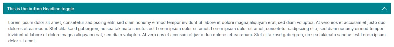
And you can toggle the content with a click on the button. The styling needs to be done still. There are a couple of ways how a FAQ or Collapse element can look like. So we will not do the styling here. We will extend that element and do the styling in another post or you can do the styling on your own! That's it! Let's wrap it up.
Conclusion
In this blog post, we learned how to create a CMS-Block and a CMS-Element in Shopware. Specifically, we built a single FAQ block and element, adding a text field for the headline and some styling for the preview. We also saw how to register the block and element, and how to add them to the Shopware administration. By following the step-by-step guide. To sum it up: CMS-Elements are a great way to extend Shopware.