Building simple filter with Nuxt3 - Composition API

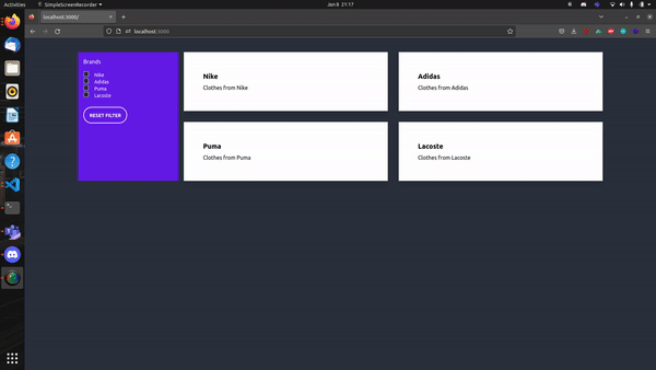
Let's build a simple filter with Nuxt 3 and the Composition API. We will also use tailwind and daisyUI for the styling. In the end, we should have something like this
Creating the Nuxt 3 Project
First, we need to create our Nuxt project. We'll do this by using nuxi.
npx nuxi init <project-name>
Navigate into your project directory and run
npm i
Installing Nuxt tailwind module
I already went through the steps of installing tailwind in a Nuxt project in a different blog post. Let's take a look at it once again.
We are using the Nuxt tailwind module. It's pretty straightforward. Just run
npm install --save-dev @nuxtjs/tailwindcss
The last step is to add the module to our nuxt.config.ts
// https://nuxt.com/docs/api/configuration/nuxt-config
export default defineNuxtConfig({
    modules: ['@nuxtjs/tailwindcss']
})
That's it! Now we are ready to use tailwind in our project. Let's add daisyUI.
Installing daisyUI
Luckily installing daisyUI is pretty fast as well. Just run:
npm i daisyui
After that, we need to create our tailwind.config.js file. In that file, we need to add this piece of code
module.exports = {
    plugins: [require('daisyui')],
};
That's it. We are all set up now. Our project is ready to use tailwind and we also can use all components from daisyUI. For our filter project, we only need the Checkbox Component. Let's start now!
Creating the component
First, let's create our components directory in that directory we place a file Filter.vue. That's where we create our component.
We are using the composition API and getting our data from the component. You can adjust it and get the data from wherever you want.
<script setup>
const brands = ref([
    {
        id: 1,
        headline: "Nike Clothes",
        description: "Clothes from Nike",
        brand: "Nike"
    },
    {
        id: 2,
        headline: "Adidas Clothes",
        description: "Clothes from Adidas",
        brand: "Adidas"
    },
    {
        id: 3,
        headline: "Puma Clothes",
        description: "Clothes from Puma",
        brand: "Puma"
    },
    {
        id: 4,
        headline: "Lacoste Clothes",
        description: "Clothes from Lacoste",
        brand: "Lacoste"
    }
]);
</script>
That's our Array of objects. We want to build a simple filter that only displays the selected brands. Let's create the filter checkboxes first.
<template>
    <div class="container mx-auto lg:grid grid-cols-5 gap-4">
        <div class="bg-primary text-white p-4">
            <p class="mb-4">Brands</p>
            <div v-for="brand in brands" class="form-control">
                <label class="cursor-pointer flex">
                    <input :value="brand.brand" v-model="filterBrands" type="checkbox"
                        class="checked:border-white checkbox-xs checkbox-primary" />
                    <span class="ml-4 text-white label-text">{{ brand.brand }}</span>
                </label>
            </div>

        </div>
    </div>
</template>
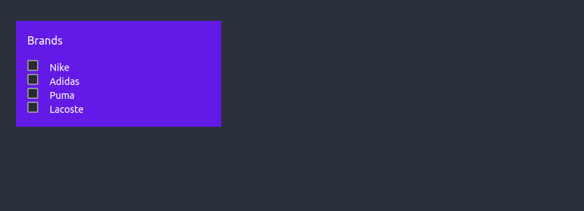
This is what our filters will look like. We just used the checkboxes from daisyUI they work and we don't have to care much about the styling. Now that we have the filters we also need the cards and add functionality to the filters. At the moment we only have something like this:
Adding functionality
Maybe you already noticed the input has a :value and v-model. That's what we need. Let's also quickly add a reset function to reset all filters. If we put it all together our component should now look like this:
<script setup>
const brands = ref([
    {
        id: 1,
        headline: "Nike Clothes",
        description: "Clothes from Nike",
        brand: "Nike"
    },
    {
        id: 2,
        headline: "Adidas Clothes",
        description: "Clothes from Adidas",
        brand: "Adidas"
    },
    {
        id: 3,
        headline: "Puma Clothes",
        description: "Clothes from Puma",
        brand: "Puma"
    },
    {
        id: 4,
        headline: "Lacoste Clothes",
        description: "Clothes from Lacoste",
        brand: "Lacoste"
    }
]);
const filterBrands = ref([]);

function resetFilter() {
    filterBrands.value = [];
}
</script>
<template>
    <div class="container mx-auto lg:grid grid-cols-5 gap-4">
        <div class="bg-primary text-white p-4">
            <p class="mb-4">Brands</p>
            <div v-for="brand in brands" class="form-control">
                <label class="cursor-pointer flex">
                    <input :value="brand.brand" v-model="filterBrands" type="checkbox"
                        class="checked:border-white checkbox-xs checkbox-primary" />
                    <span class="ml-4 text-white label-text">{{ brand.brand }}</span>
                </label>
            </div>
            <button @click="resetFilter()"
                class="my-6 px-4 w-fit btn bg-transparent border-white border-2 text-white hover:bg-primary hover:border-white rounded-full">
                Reset Filter
            </button>
        </div>
    </div>
</template>
That's already all we need to make our filter work. We need to display our cards depending on the filter selected somehow. At the moment we don't see an items. So let's do this now!
Display filtered cards
To display filtered cards we need to loop through our object and check the filter. We do it something like this:
<template>
    <div class="container mx-auto lg:grid grid-cols-5 gap-4">
        <div class="bg-primary text-white p-4">
            <p class="mb-4">Brands</p>
            <div v-for="brand in brands" class="form-control">
                <label class="cursor-pointer flex">
                    <input :value="brand.brand" v-model="filterBrands" type="checkbox"
                        class="checked:border-white checkbox-xs checkbox-primary" />
                    <span class="ml-4 text-white label-text">{{ brand.brand }}</span>
                </label>
            </div>
            <button @click="resetFilter()"
                class="my-6 px-4 w-fit btn bg-transparent border-white border-2 text-white hover:bg-primary hover:border-white rounded-full">
                Reset Filter
            </button>
        </div>
        <div class="col-span-4">
            <div class="grid auto-rows-fr grid-cols-1 md:grid-cols-2 gap-8">
                <div v-for="brand in brands" :key="brand.id">
                    <div class="bg-white shadow-lg p-6 hover:bg-primary text-black hover:text-white hover:cursor-pointer"
                        v-if="filterBrands.includes(brand.brand) && filterBrands.length > 0">
                        <div class="card-body">
                            <h2 class="card-title">{{ brand.brand }}</h2>
                            <p>{{ brand.description }}</p>
                        </div>
                    </div>
                </div>
            </div>
        </div>
    </div>
</template>
That already works pretty well! If we now take a look at the browser we still see no cards but if we select a filter they get displayed like this:
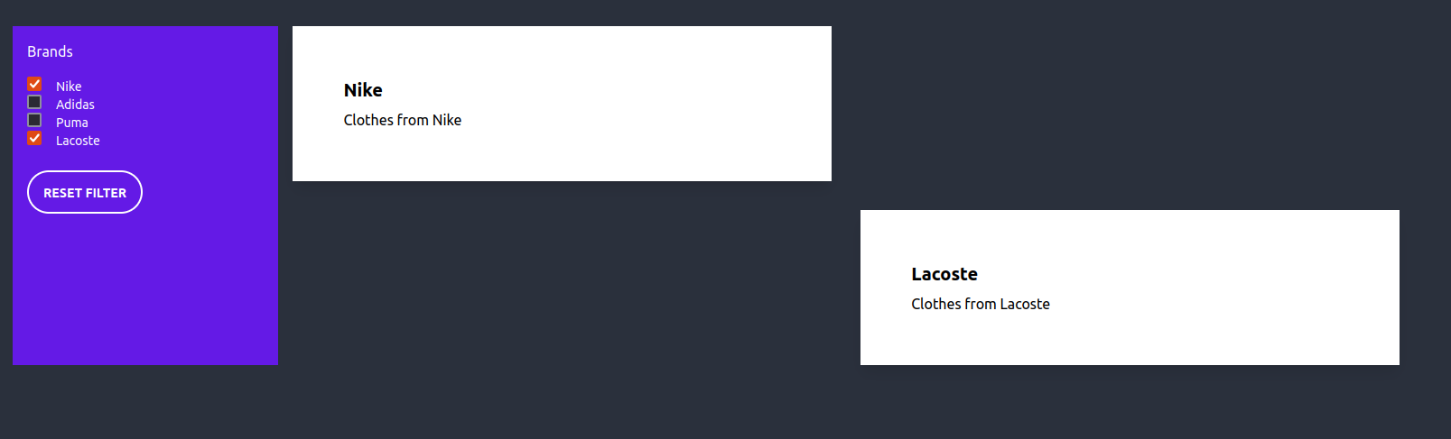
There are still some things that we need to fix right? First, if no filter is selected I want to see all cards. The second thing is that we have blank squares because we are using grid and there are some empty divs. The solution here could be to use flex instead. But there is also a different solution.
To display all items or cards we can simply add a v-if and a v-else. We check if the filter array contains any items. If not we just display all items. If we put all together once again we get something like this:
<script setup>
const brands = ref([
    {
        id: 1,
        headline: "Nike Clothes",
        description: "Clothes from Nike",
        brand: "Nike"
    },
    {
        id: 2,
        headline: "Adidas Clothes",
        description: "Clothes from Adidas",
        brand: "Adidas"
    },
    {
        id: 3,
        headline: "Puma Clothes",
        description: "Clothes from Puma",
        brand: "Puma"
    },
    {
        id: 4,
        headline: "Lacoste Clothes",
        description: "Clothes from Lacoste",
        brand: "Lacoste"
    }
]);
const filterBrands = ref([]);

function resetFilter() {
    filterBrands.value = [];
}
</script>
<template>
    <div class="container mx-auto lg:grid grid-cols-5 gap-4">
        <div class="bg-primary text-white p-4">
            <p class="mb-4">Brands</p>
            <div v-for="brand in brands" class="form-control">
                <label class="cursor-pointer flex">
                    <input :value="brand.brand" v-model="filterBrands" type="checkbox"
                        class="checked:border-white checkbox-xs checkbox-primary" />
                    <span class="ml-4 text-white label-text">{{ brand.brand }}</span>
                </label>
            </div>
            <button @click="resetFilter()"
                class="my-6 px-4 w-fit btn bg-transparent border-white border-2 text-white hover:bg-primary hover:border-white rounded-full">
                Reset Filter
            </button>
        </div>
        <div class="col-span-4">
            <div class="grid auto-rows-fr grid-cols-1 md:grid-cols-2 gap-8">
                <div v-if="filterBrands.length > 0" v-for="brand in brands" :key="brand.id">
                    <div class="bg-white shadow-lg p-6 hover:bg-primary text-black hover:text-white hover:cursor-pointer" v-if="filterBrands.includes(brand.brand) && filterBrands.length > 0">
                        <div class="card-body">
                            <h2 class="card-title">{{ brand.brand }}</h2>
                            <p>{{ brand.description }}</p>
                        </div>
                    </div>
                </div>
                <div v-else v-for="brand in brands">
                    <div class="bg-white shadow-lg p-6 hover:bg-primary text-black hover:text-white hover:cursor-pointer">
                        <div class="card-body">
                            <h2 class="card-title">{{ brand.brand }}</h2>
                            <p>{{ brand.description }}</p>
                        </div>
                    </div>
                </div>
            </div>
        </div>
    </div>
</template>
Styles
The only thing missing now is the styling. There is a simple tailwind class to fix our issue. The issue is that we put empty divs in our grid because we have a loop that iterates through our whole array. We simply can check if the div is empty and if it is we hide the div.
So in the end the component looks like this:
<script setup>
const brands = ref([
    {
        id: 1,
        headline: "Nike Clothes",
        description: "Clothes from Nike",
        brand: "Nike"
    },
    {
        id: 2,
        headline: "Adidas Clothes",
        description: "Clothes from Adidas",
        brand: "Adidas"
    },
    {
        id: 3,
        headline: "Puma Clothes",
        description: "Clothes from Puma",
        brand: "Puma"
    },
    {
        id: 4,
        headline: "Lacoste Clothes",
        description: "Clothes from Lacoste",
        brand: "Lacoste"
    }
]);
const filterBrands = ref([]);

function resetFilter() {
    filterBrands.value = [];
}
</script>
<template>
    <div class="container mx-auto lg:grid grid-cols-5 gap-4">
        <div class="bg-primary text-white p-4">
            <p class="mb-4">Brands</p>
            <div v-for="brand in brands" class="form-control">
                <label class="cursor-pointer flex">
                    <input :value="brand.brand" v-model="filterBrands" type="checkbox"
                        class="checked:border-white checkbox-xs checkbox-primary" />
                    <span class="ml-4 text-white label-text">{{ brand.brand }}</span>
                </label>
            </div>
            <button @click="resetFilter()"
                class="my-6 px-4 w-fit btn bg-transparent border-white border-2 text-white hover:bg-primary hover:border-white rounded-full">
                Reset Filter
            </button>
        </div>
        <div class="col-span-4">
            <div class="grid auto-rows-fr grid-cols-1 md:grid-cols-2 gap-8">
                <div class="empty:hidden" v-if="filterBrands.length > 0" v-for="brand in brands" :key="brand.id">
                    <div class="bg-white shadow-lg p-6 hover:bg-primary text-black hover:text-white hover:cursor-pointer" v-if="filterBrands.includes(brand.brand) && filterBrands.length > 0">
                        <div class="card-body">
                            <h2 class="card-title">{{ brand.brand }}</h2>
                            <p>{{ brand.description }}</p>
                        </div>
                    </div>
                </div>
                <div v-else v-for="brand in brands">
                    <div class="bg-white shadow-lg p-6 hover:bg-primary text-black hover:text-white hover:cursor-pointer">
                        <div class="card-body">
                            <h2 class="card-title">{{ brand.brand }}</h2>
                            <p>{{ brand.description }}</p>
                        </div>
                    </div>
                </div>
            </div>
        </div>
    </div>
</template>
And that's it! We are done now. Thanks for reading!


