


This tutorial is based on how to create a CMS-Block in Shopware 6.
If you haven't read that post yet make sure to do it now. As always I also recommend you take a look at the official Shopware 6 documentation.
The CMS-Block code
We already built our CMS-Block in the last guide. You can also checkout the code on github.
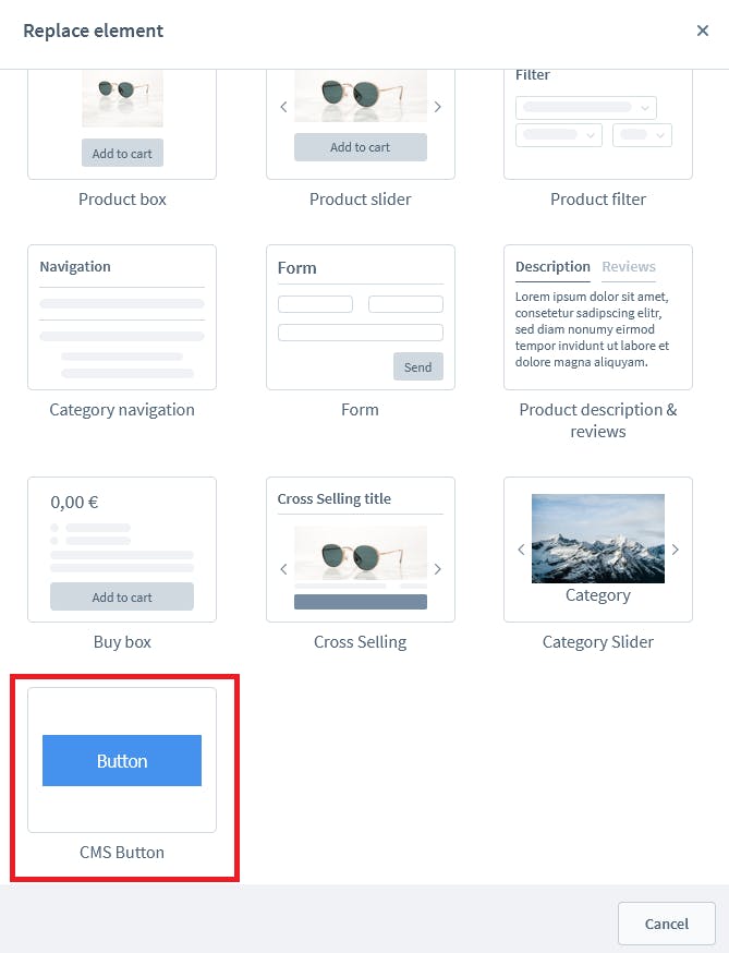
Now imagine you really want to create a button in the shopping experiences. You want to define the text of the button, the width, the height and the link the button is directing to. That‘s not possible with a simple CMS-Block. That‘s why we create a CMS-Element in this guide now.
What is a CMS-Element?
In our last guide I described the CMS-Block as the outer wrapper. The CMS-Element is the element in a block. That means you can put every CMS-Element in a block. We created a simple button CMS-Block in the first guide and we also can change the element within the block to an image for example.
We actually placed a text element in our CMS-Block in the last guide, do you remember?

Now we can change the element as you can see but the block will always remain the same. It's time to take a look at the code so we actually get a button element!
The administration code
Since the CMS-Block code is our base code we will start with the main.js file which already should exist in our plugin. In the main.js you just do the import so your code will be automatically found by Shopware.
/* Import the block directory */
import './module/sw-cms/blocks/text/cms-button';

/* Import the elements directory */
import './module/sw-cms/elements/cms-button'
Now we imported a directory which doesn‘t exists yet. Let‘s go ahead and create all the stuff we need for our CMS-Element!
Registering a new CMS-Element
We will start with the index.js for the CMS-Element. If you followed the CMS-Block-Guide this should look familiar. We place the index.js in /src/Resources/app/administration/src/module/sw-cms/elements/cms-button
import './component';
import './config';
import './preview';


Shopware.Service('cmsService').registerCmsElement({
    name: 'cms-button',
    label: 'sw-cms.blocks.text.ninja-cms-button.label',
    component: 'sw-cms-el-cms-button',
    configComponent: 'sw-cms-el-config-cms-button',
    previewComponent: 'sw-cms-el-preview-cms-button',
    defaultConfig: {
        title: {
            source: 'static',
            value: 'ButtonText'
        },
        textColor: {
            source: 'static',
            value: '#fff'
        },
        url: {
            source: 'static',
            value: ''
        },
        newTab: {
            source: 'static',
            value: 'true'
        },
        buttonAlign: {
            source: 'static',
            value: 'center'
        },
        buttonColor: {
            source: 'static',
            value: '#4492ed'
        },
        buttonWidth: {
            source: 'static',
            value: ''
        },
        buttonHeight: {
            source: 'static',
            value: ''
        }
    },

});
Since you should know how this works already I will not explain it in this guide again. The only thing that is different from the CMS-Block Guide is that we have a lot of more defaultConfig. As you maybe already can imagine all the things we defined here in the defaultConfig will be configurable in our CMS-Element when we are done.
I know that you also could add a little bit more config for a button but I think that we covered the basic config fields for a button and you should understand how everything works.
At the beginning of the file we see 3 imports. We need to create those directories first. Let‘s start with the CMS-Element component!
The CMS-Element component
Let's take a look at the code of the element component. We create a index.js and place it in /src/Resources/app/administration/src/module/sw-cms/elements/cms-button/component/. You probably should know that Shopware works with Vue.js and we can see it in action here.
import template from './sw-cms-el-cms-button.html.twig';
import './sw-cms-el-cms-button.scss';

const { Component, Mixin } = Shopware;

Component.register('sw-cms-el-cms-button', {
    template,

    inject: ['repositoryFactory'],

    mixins: [
        Mixin.getByName('cms-element')
    ],

    created() {
        this.createdComponent();
    },

    computed: {
        buttonStyles() {
            const styles = {};
            if (this.element.config.textColor.value && this.element.config.buttonColor.value ) {
                styles.color = `${this.element.config.textColor.value}`;
                styles.backgroundColor = `${this.element.config.buttonColor.value}`;

            }
            if (this.element.config.buttonWidth.value) {
                styles.width = `${this.element.config.buttonWidth.value}px`;
            } else {
                styles.width = "auto";
            }

            if (this.element.config.buttonHeight.value) {
                styles.height = `${this.element.config.buttonHeight.value}px`;
            } else {
                styles.height = "auto";
            }

            return styles;
        },
        buttonAlignStyle() {
            const styles = {};
            if (this.element.config.buttonAlign.value) {
                styles.justifyContent = `${this.element.config.buttonAlign.value}`
            }

            return styles;
        }
    },

    methods: {
        createdComponent() {
            this.initElementConfig('cms-button');
            this.initElementData('cms-button');
        },

        onInputText(text) {
            this.emitChanges(text);
        },
    }
});
We just registered our component. The important things happen with the method initElementConfig which takes care of dealing with the configComponent. As you can see there is a bit more to it. We are using computed properties from Vue to do the styling of the button and to align the button.
Now let‘s create the CMS-Element component so you can see how we can make use of the computed properties!
We create a twig file sw-cms-el-cms-button.html.twig in the directory src/Resources/app/administration/src/module/sw-cms/elements/cms-button/component
{% block sw_cms_element_ninja_cms_button %}
    <div class="sw-cms-el-ninja-cms-button" v-model="element.config.buttonAlign.value" :style="buttonAlignStyle">
        <a href="{{element.config.url.value}}" target="_blank" v-model="element.config.title.value" @input="onInputText">
            <button class="sw-el-ninja-btn" :style="buttonStyles">{{element.config.title.value}}</button>
        </a>
    </div>
{% endblock %}
As you can see on this code we are making use of the computed properties we just defined here. And that will take care of the styling in the administration.
The alignment in this example is handled by flex-box. So we need to add a bit of CSS in our sw-cms-el-cms-button.scss.
.sw-cms-el-ninja-cms-button {
    display: flex;
    width: 100%;

    button {
        outline: none;
    }

}

.sw-el-ninja-btn {
    padding: 1rem;
}

.sw-el-ninja-btn:focus {
    outline: none;
}
And that‘s all for our CMS-Element component. Now we just need to create the preview and the config. Let‘s move on with the preview!
The CMS-Element preview component
The preview component works pretty much the same. You already saw that in the CMS-Block-Guide as well so let‘s dive into the code.
Like always we have to register our component with an index.js placed in src/Resources/app/administration/src/module/sw-cms/elements/cms-button/preview/
import template from './sw-cms-el-preview-cms-button.html.twig';
import './sw-cms-el-preview-cms-button.scss';

const { Component } = Shopware;

Component.register('sw-cms-el-preview-cms-button', {
    template
});
Next step would be to add the template. We place a file sw-cms-el-preview-cms-button.html.twig in the directory src/Resources/app/administration/src/module/sw-cms/elements/cms-button/preview/
{% block sw_cms_element_ninja_button_preview %}
    <div class="ninja-button-preview">
        <button class="ninja-btn">Button</button>
    </div>
{% endblock %}
And the last thing we need to do is to add a bit of CSS code to it. Since it‘s just the preview component we don‘t have to take care about any configs. We just can style the button like we want. In my case I decided to add the following CSS in sw-cms-el-preview-cms-button.scss to it:
.ninja-button-preview {
    display: flex;
    justify-content: center;
    align-items: center;
    height: 100%;

    .ninja-btn {
        background-color: #4492ed;
        border: none;
        color: #fff;
        padding: 14px 50px;
        text-align: center;
        text-decoration: none;
        display: inline-block;
        font-size: 16px;
        margin: 30px 0;
    }
}
And that‘s it! Now we can see the element preview right here (you need to build the administration for it and remove the imports you don't have yet)
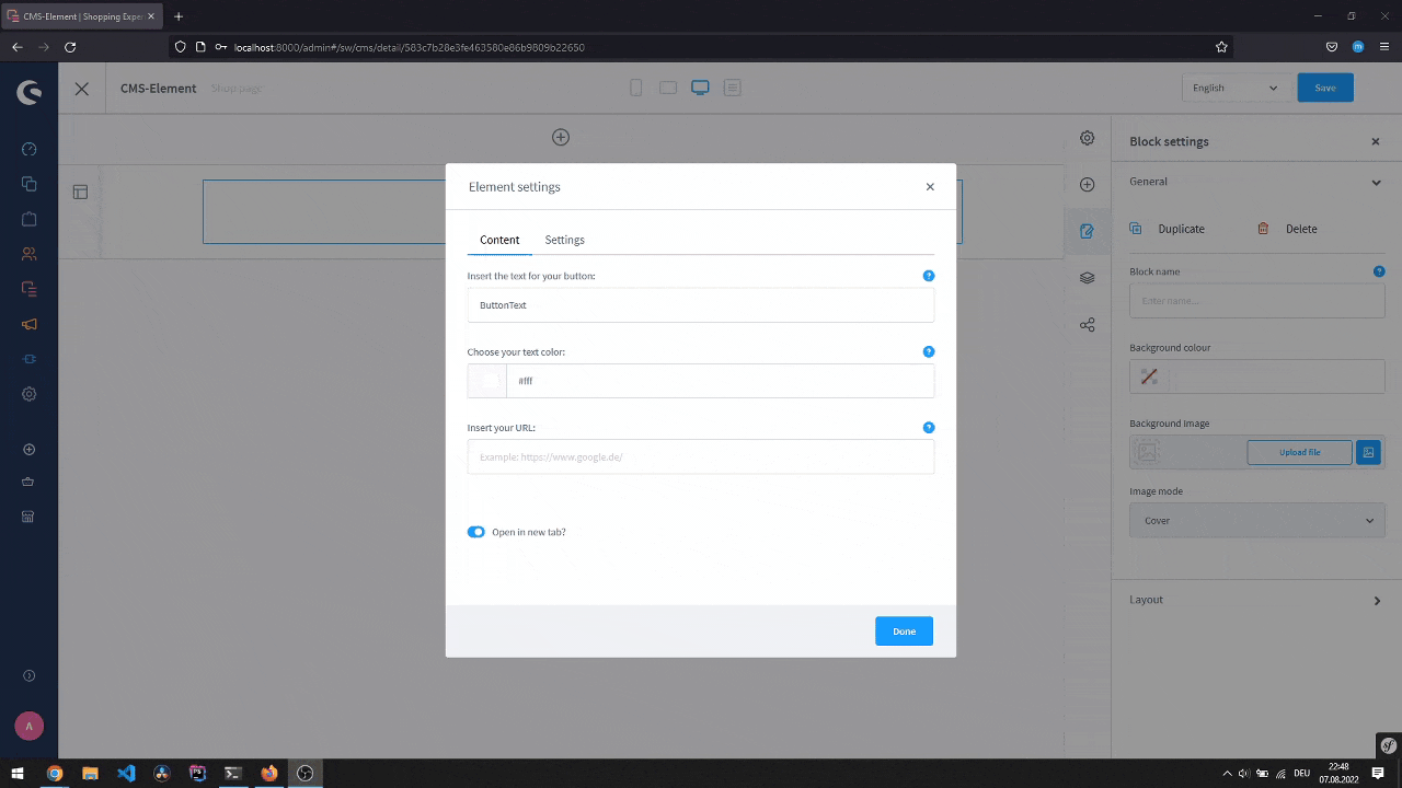
CMS-Element config component
The last thing we need to do is to create our config component. It always starts the same so let‘s create our index.js in src/Resources/app/administration/src/module/sw-cms/elements/cms-button/config/
import template from './sw-cms-el-config-cms-button.html.twig';

const { Component, Mixin } = Shopware;


Component.register('sw-cms-el-config-cms-button', {
    template,

    inject: ['repositoryFactory'],

    mixins: [
        Mixin.getByName('cms-element')
    ],

    created() {
        this.createdComponent();
    },

    methods: {
        createdComponent() {
            this.initElementConfig('cms-button');
        },

        onElementUpdate(element) {
            this.$emit('element-update', element);
        },
        onInputText(title) {
            this.emitChanges(title);
        }
    }

});
That‘s all we need to do in our index.js. Now we need to create the view for the config. We simply place a twig sw-cms-el-config-cms-button.html.twig file in /src/Resources/app/administration/src/module/sw-cms/elements/cms-button/config/ for that. That config can have as many tabs and as many config fields as you configure. In our example it looks like this:
{% block sw_cms_el_ninja_cms_button %}
    <sw-tabs class="sw-cms-el-config-ninja-cms-button__tabs" defaultItem="content">

        <template slot-scope="{ active }">
            {% block sw_cms_el_config_ninja_button_tab_content %}
                <sw-tabs-item :title="$tc('sw-cms.elements.general.config.tab.content')" name="content" :activetab="active">
                    {{ $tc('sw-cms.elements.general.config.tab.content') }}
                </sw-tabs-item>
            {% endblock %}
            {% block sw_cms_el_ninja_button_config_tab_options %}
                <sw-tabs-item :title="$tc('sw-cms.elements.general.config.tab.settings')" name="settings" :activetab="active">
                    {{ $tc('sw-cms.elements.general.config.tab.settings') }}
                </sw-tabs-item>
            {% endblock %}
        </template>

        <template slot="content" slot-scope="{ active }">
            {% block sw_cms_el_ninja_cms_button_config_content %}
                <sw-container v-if="active === 'content'" class="sw-cms-el-config-ninja-button__tab-content">
                    <sw-text-field :label="$tc('sw-cms.elements.ninja-cms-button.config.label.buttonText')" :placeholder="$tc('sw-cms.elements.ninja-cms-button.config.placeholder.buttonText')" v-model="element.config.title.value" @element-update="onElementUpdate" :helpText="$tc('sw-cms.elements.ninja-cms-button.config.helpText.buttonText')"></sw-text-field>
                    <sw-colorpicker v-model="element.config.textColor.value" :label="$tc('sw-cms.elements.ninja-cms-button.config.label.buttonTextColor')" coloroutput="hex" :zIndex="1001" :alpha="true" :helpText="$tc('sw-cms.elements.ninja-cms-button.config.helpText.buttonTextColor')"></sw-colorpicker>

                    <sw-field v-model="element.config.url.value" :label="$tc('sw-cms.elements.ninja-cms-button.config.label.buttonUrl')" :placeholder="$tc('sw-cms.elements.ninja-cms-button.config.placeholder.buttonUrl')" :helpText="$tc('sw-cms.elements.ninja-cms-button.config.helpText.buttonUrl')"></sw-field>
                    <sw-field v-model="element.config.newTab.value" type="switch" :label="$tc('sw-cms.elements.ninja-cms-button.config.label.newTab')"></sw-field>
                </sw-container>
            {% endblock %}

            {% block sw_cms_el_ninja_button_config_settings %}
                <sw-container v-if="active === 'settings'" class="sw-cms-el-config-ninja-button__tab-settings">
                    {% block sw_cms_el_cms_ninja_button_config_settings_horizontal_align %}
                        <sw-select-field :label="$tc('sw-cms.elements.ninja-cms-button.config.label.hAlignment')" v-model="element.config.buttonAlign.value" :placeholder="$tc('sw-cms.elements.ninja-cms-button.config.placeholder.hAlignment')">
                            <option value="flex-start">left</option>
                            <option value="center">center</option>
                            <option value="flex-end">right</option>
                        </sw-select-field>
                        <sw-colorpicker v-model="element.config.buttonColor.value" :label="$tc('sw-cms.elements.ninja-cms-button.config.label.buttonColor')" coloroutput="hex" :zIndex="1001" :alpha="true" :helpText="$tc('sw-cms.elements.ninja-cms-button.config.helpText.buttonColor')"></sw-colorpicker>
                        <sw-field v-model="element.config.buttonWidth.value"
                                      type="number"
                                      :label="$tc('sw-cms.elements.ninja-cms-button.config.label.width')"
                                      :placeholder="$tc('sw-cms.elements.ninja-cms-button.config.placeholder.width')">
                                <template #suffix>px</template>
                        </sw-field>
                        <sw-field v-model="element.config.buttonHeight.value"
                                      type="number"
                                      :label="$tc('sw-cms.elements.ninja-cms-button.config.label.height')"
                                      :placeholder="$tc('sw-cms.elements.ninja-cms-button.config.placeholder.height')">
                                <template #suffix>px</template>
                        </sw-field>

                    {% endblock %}
                </sw-container>
            {% endblock %}
        </template>
    </sw-tabs>
{% endblock %}
Now we are pretty much done with our config component. Please take a look at the v-model fields, these are the fields we also created in our component which is important. If you have a typo here things will not work.
And that‘s all for the CMS-Element administration. Now you know how to create a CMS-Element in Shopware 6 at least in the administration
Back to the CMS-Block
Now before we see the element like we want it to see we have to make a small change. For that we need to go back into a file we created in our "how to create a CMS-Block in Shopware 6 Guide"
We have a index.js with a slot in the /src/Resources/app/administration/src/module/sw-cms/blocks/text/cms-button/ directory. Maybe you remember that we gave the slot the text element. It‘s time to give it the cms-button element now.
import './component';
import './preview';

Shopware.Service('cmsService').registerCmsBlock({
    name: 'cms-button',
    label: 'sw-cms.blocks.text.ninja-cms-button.label',
    category: 'text',
    component: 'sw-cms-block-button',
    previewComponent: 'sw-cms-preview-button',
    defaultConfig: {
        marginBottom: '20px',
        marginTop: '20px',
        marginLeft: '20px',
        marginRight: '20px',
        sizingMode: 'boxed'
    },
    /* Changed this line of code */
    slots: {
        button: 'cms-button'
    }
});
Now you only need to build the administration and everything should work! Development Template ./psh.phar administration:build Production Template ./bin/build-administration.sh
The storefront view
Of course we need to implement the storefront view as well. We want to see the button we configured in the shopping experiences in the frontend as well.
First let‘s adjust the code in cms-block-cms-button.html.twig from our last guide in the /src/Resources/views/storefront/block/ directory
{% block block_cms_button_block %}
    {% set element = block.slots.getSlot('button') %}
    {% set columns = 1 %}

    <div class="col-12" data-cms-element-id="{{ element.id }}">
        {% block block_text_inner %}
            {% sw_include "@Storefront/storefront/element/cms-element-" ~ element.type ~ ".html.twig" ignore missing %}
        {% endblock %}
    </div>
{% endblock %}
So now the our block can get any element and just works as an outer wrapper for the element. We actually want to react to the configuration we get from the backend or shopware administration. For that we create a new file cms-element-cms-button.html.twig in the /src/Resources/views/storefront/element/ directory
{% block element_text %}
    {%  set config = element.fieldConfig.elements %}

    <div class="cms-element-{{ element.type }} ninja-cms-button-flex ninja-cms-button-flex{% if config.buttonAlign.value == "center" %}-center{% elseif config.buttonAlign.value == "flex-end" %}-end{% else %}-start{% endif %}">
        {% block element_text_button %}
            <a href="{{config.url.value}}" {% if config.newTab.value %} target="_blank" {% endif %}>
                <button class="ninja-cms-btn" style="color: {{ config.textColor.value }}; background-color: {{ config.buttonColor.value }}; {% if config.buttonWidth.value != 0 %}width: {{config.buttonWidth.value}}px;{% else %}width: auto{% endif %}">
                    {{ config.title.value }}
                </button>
            </a>
        {% endblock %}
    </div>
{% endblock %}
As you can see it‘s pretty easy to get the config fields. And that‘s it! Now you created your first complete CMS-Element. Let's take a look at the button in the storefront.
Github
If you want to take a look at the complete code just checkout the repository on github!
Bugfix
There is a bug in this guide - If you use Shopware 6.5, please take a look at the CMS-Guide Bugfix.